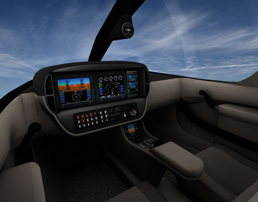
Copy added to Production Notes for this revision:
06.25.2009 - Time was at hand to re-do the interior. I hate how things progress and evolve and how great work yesterday is invalidated tomorrow. <redacted> Anyway, up goes the ante. New Mark II CTJ interior is fully renderbaked with all new custom texture treatments, custom solutions, custom design, and more. Even for me.. I personally find this new interior design to be extremely, if not excessively pleasant to fly in. It is time to choose some specific design deviations by which to evolve forward in such a way to merge the 2d panel with the 3d cockpit in a similar manner to the SR2X. First point to remember is that the concept mockup shows nothing where anything is, namely switches, buttons and controls, let alone any placards. It shows only a flat screen with nothing present. Is it a panel to install integrated units into, or is it a big widescreen monitor that all will be displayed on? The bolster panel, does it flip up or down, is it just that way for looks, etc. Hehe.. and made worse that combined with Cirrus having some schizoprhenia about their naming. "the-Jet" turned into SJ-50 (if S=Cirrus, R=Recip, J=Jet).. now it's SF-50?? what gives. (Fan? how ridiculous, it is not a high-bypass "fanjet", it's a medium bypass at best turbofan.. but in truth, it's a "JET" so I don't know why they keep changing the designation for. CTJ still applies and remains my official moniker for the model. Anyway, back on subject about the Mk2 re-design. The standby glass system screen is the same. it is a separate avionics unit other than the Avidyne systems, where on the secondary PFD additional system controls such as autopilot values, other mode engage buttons, other variable values can be adjusted, etc. If you haven't had a close look at the standby #2 PFD. have a zoom in on it. But about the main 'pod'. I chose to consider the base panel a panel by which unit separates are installed to make it look and feel more authentic. as it didn't look right to appear to have avidyne and garmin things on a lcd screen along with free floating item like the AOA and AP mode annun. So, the panel base panel is rendered, and the instrument content is merged merged with it. All of the in-pod instrument units are color matched so that it really looks like an awesome and perfect 'instrument pod'. New to this version is a garminlike audio panel, and installation of a garminlike FMS down forward of the throttle. Additionally, and the greatest and most noticeable new feature is the inset switch panel on the lower pod bolster. This has all the switches previously from the 2D panel inset region, plus now authentic cirrus placard remarks, knobs, lighting rheostats, more conventional STEK AP mode annunciator and my favorite VDO style analog AOA gauge. All in all the new pod looks REALLY sharp. On that note, down on the center console surrounding the throttle, forward of the armrest, is installed items for OAT, Chronograph/timer, analog dual-fuel gauge, and the CAPS parachute system button. One very unique thing to this whole solution, is that ... "the 2D panel is fully dynamic and re-arrangeable" while it is also the texture used on the 3d structures. So. if you want to add any instruments to the bolster inset region like standby's. any additional icing system switches, you can (for your own use only) edit the panel_2D in plane-maker and move things arund wherever you want. If you want different Radios, different autopilot buttons, The regions are defined by the rendered areas. This version also introduces a conventional compass slung from the windshield pilar. And probably one of the extra cool new features, is that the interior can now change color with livery choice. Presently I haven't done any alternate colors. but I may very soon. duo-tone black/charcoal, possibly a red and blue tone to go with the red & blue Cirrus Perspecive style paints, etc. The default and standard color is neutral tan-beige/black-grey. The regions are not particularly end user color changeable, but if you ahve a color request, you can ask for it. (a color swatch image would be helpful for setting the right color you want). At this time however, because of the re-do.. the LIT interior texture is now gone. I'll be re-doing that sometime in the forseeable future with blender rendered lights, and only one LIT version as I would do it. This also invalidates the previous interior & texture, so it cannot be used or re-installed.

